PowerApps provide lots of options when you are designing a coordinated and synchronized color pattern for your applications.
I started looking at some videos from Microsoft on how to design and create a more User appealing application and have an easier way to theme the application or add controls that will look and feel the same way, I was looking a video from Veronica Ward ( Audrie Gordon Youtube channel) and Veronica was mentioning about control consistency and alignment, really important when creating screens and forms to have a good alignment and spacing in between controls for better User interaction but also she display a way to coordinate all controls and colors on the screen.
Looking at this concepts and ideas on how to use the controls I recreated Veronica’s PowerApp and emulated almost the same, you will see this later on a video that I just created for this blog post, I have a glance on the bottom of the post with an animated GIF, with no sound.
The most important tools to use in this scenario are 2 main controls you are going to base your consistency and alignment, in my case I created a Rectangle icon control on the top of the screen and called HeaderBox, this control will be in charge of the color coordination on the application, all the controls will be using the following in the Fill event, HeaderBox.Fill and in some of the controls that I use as sub-headers I use the function ColorFade to create a similar color coordination, something like this ColorFade(HeaderBox.Fill, 60%), depending on the area I will be adding more % (percentage) or lower for a more dramatic color presentation.
The second main control is the ProjectHeader label on the top of the control this label will base the Font, Font size for all the controls in the application.
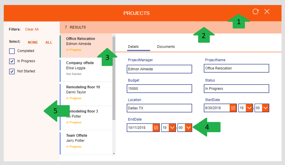
These are the functions I used to Coordinate the Colors and use a synchronized look and feel on the form.
- #1 HeaderBox.Fill = RGBA(246, 88, 16, 1) or Orange
- #2 SubHeaderBox.Fill = ColorFade(HeaderBox.Fill, 60%)
- #3 ProjectGallery.TemplateFill = If(ThisItem.IsSelected, ColorFade(HeaderBox.Fill, 80%), White)
- #4 IconFill = ProjectHeader.Color (Icon Image Color)
- IconBackground = HeaderBox.Fill
- Color = Black (Letters)
- #5 FilterBox.Fill = ColorFade(HeaderBox.Fill, 95%)

Hope this will help you design and create a more appealing application, I been using this pattern and it’s helping me a lot when changing or rearranging color schemes or different color pallets.
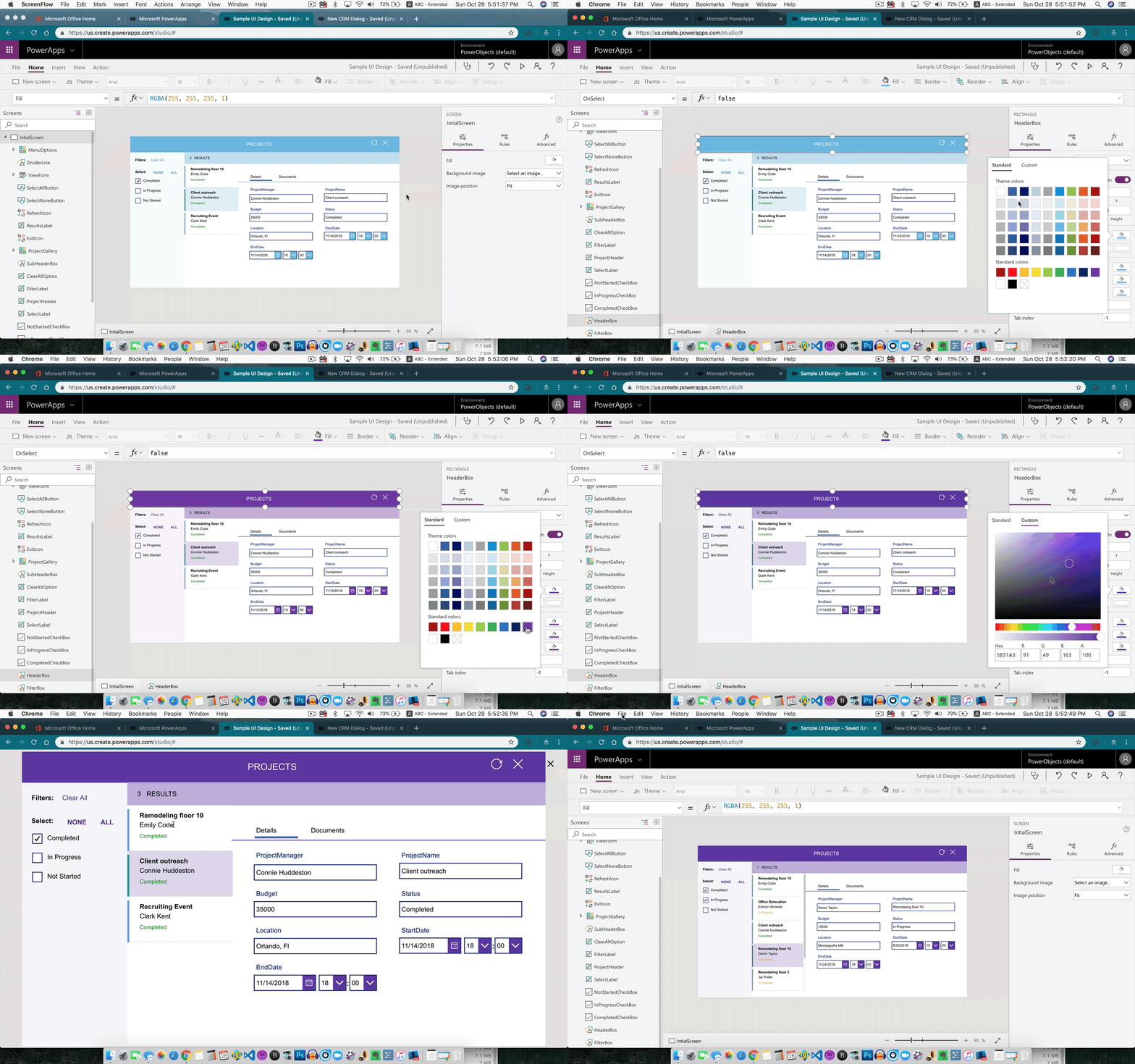
Check the Video (animated GIF) to see these concepts implemented and have a better understanding of how this will help you.

Hope this blog post helps you and if you have questions please add your comments or send me an email I will reply as soon as possible.
abe.