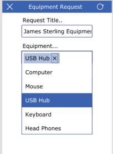
Color coordination was the original PowerApps blog post on my blog, this is the continuation of that series of theme applications and controls synchronization.
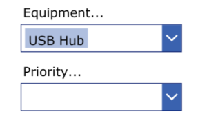
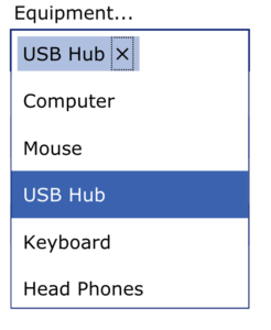
One of the complex controls in PowerApps is the DropDown controls, you can search values and have multiselection also, I want to have a way to change the colors, accordingly to the topmost control that I called the HeaderBox control, this one will be the base for all the application screens color fill, and the second control is the Header Text, a label that will be the base of the Font, Font color and Size on all the form controls and all app screens.
Having those 2 controls as the base of the application UI theme synchronization allows to change the colors and fonts on one location and these will apply to all the application and all screens.

The way to change the Dropdown to coordinate with the theme is using the following control events to change some of the most important UI colors patterns

- ChevronBackgorund = HeaderBox.Fill
- ChevronFill = HeaderText.Color
- ChevronHoverBackground = ColorFade(HeaderBox.Fill, -20%)
- ChevronHoverFill = HeaderText.Color
- Fill = White
- Font = HeaderText.Font
- HoverFill = ColorFade(HeaderBox.Fill, 60%)
- IsSearchable = False
- PressedColor = HeaderText.Color
- SelectionColor = HeaderText.Color
- SelectionFill = HeaderBox.Fill
- SelectMultiple = false
- Size = HeaderText.Size

Hope this will help you use the color coordination and allow to create a more appealing User Interphase, these are some of the tips and tricks that I been working on the sample applications and demos I created, later will continue adding more tips and tricks on how to use and create better UI that will be used on your apps.
Please let me know if you have any questions on these tips and tricks, I will reply and give more details if need it.
abe.